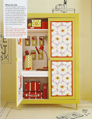
Here's what I came up with! In the photo, the walls appear to be tan, so that's how I selected my cardstock. I like the dotted accessories, so when I picked out my yellow and white paper, the dots worked for me! I love the red lines, so I put them around my photo, and since I love red, I used that for my title too. I love the white flowers in the photo, so I added just one to the corner of my photo, and I added a yellow and red center too. I wanted to keep the look very clean and simple, so I didn't do any ink distressing, which is something that I always do! Anyway, that's how the photo inspired me! Come on over to Scrap-Friendzy and play along. There's something inspiring posted every day!
I hope you're having a great day. Thanks for stopping by!


6 comments :
LOVE this Carol! Your girls are gorgeous! and the papers are beautiful! Love the red lettering and that lovely white flower too!
Isn't that inspiration photo just fantastic!
Hugs
Nicola
Very cute! The lettering is my favorite part...that and the cute picture of your girls
Heather :)
very cute!! love the colors, they are perfect with this perfect photo of the girls!! >"<
Whoa, Carol....that Monday Motivation photo is so grand. I love the colors and your layout is just perfection! Of course, it is because of your two lovely girls!!!! :-))))))They have the sweetest smiles, don't they? As I look again at the girls, I love the happiness there!
What a great photo and layout. I love your lettering you used and the writing on the bottom. It's a simple layout that says a lot.
wow lovin this one!!!Love the red!!Another awesome photo...they sure make me smile!
hugs
Brenda
Post a Comment